Reports are an invaluable tool to monitor the health of your system. You use them as the basis for meaningful conversations with the team and stakeholders. They assist you in evaluating your system and understanding where to tweak processes. The three core reports every Scrum Master should understand and use are the burndown, burnup, and throughput. These three metrics visualize current progress and past output over time.
In this blog we’ll explore the purpose of each metric, how to read each chart, and how to create each chart.
Report 1: Burndown
Purpose
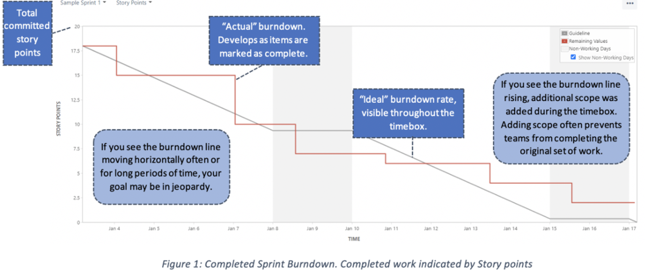
The burndown chart shows your progress toward completing a group of work items within a set timeframe. It tracks the work remaining versus the total scope on a daily basis. The burndown is a simple way to determine whether you will complete everything within the designated timebox. Using this chart, you can continually assess whether your current committed timebox and scope are on track. If you see an increased risk that you may not complete all the work or will be completing all the work before the timebox ends, it’s time for a conversation with the team and the stakeholders so you can collectively adjust the plan (often by changing scope – removing work or adding new work items – or adapting the team’s approach).
You can use the burndown chart for the sprint backlog or the release backlog.
Reading the Chart
Setting Up the Chart
- Determine what will indicate “completed work.” This data will populate the y-axis. The top of the y-axis will show the total committed work, the bottom will be zero. In between will be a range of descending numbers.
- Options include:
- Story points.
- Begins with the total number of story points for all the user stories.
- Task hours
- Begins with the total number of task hours for all the work items.
- Story points.
- Options include:
- Item count
- Begins with the total number of work items.
- Determine the dates for the timebox. This data will populate the x-axis of the chart.
- Determine which items will be in the backlog.
- Go to work!
Report 2: Burnup
Purpose
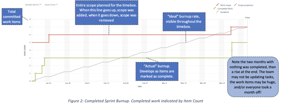
The burnup chart is similar to the burndown chart; one key difference is in the display. Rather than showing progress as descending, it displays progress as ascending. Unlike the burndown, the burnup displays the work scope on a separate line. This makes scope changes very obvious.
Like the burndown, the burnup provides a visual representation of a completed work compared with its total scope. Using the burnup is another way to track your team’s progress towards completion and identify potential problems.
Reading the Chart
Setting Up the Chart
- Determine what will indicate “completed work.” This data will populate the y-axis. The top of the y-axis will show the total committed work, the bottom will be zero. In-between will be a range of descending numbers.
- Options include:
- Story points.
- Begins with the total number of story points for all the user stories.
- Task hours
- Begins with the total number of task hours for all the work items.
- Story points.
- Options include:
- Item count
- Begins with the total number of work items.
- Determine the dates for the timebox. This data will populate the x-axis of the chart.
- Determine which items will be in the backlog.
- Go to work!
Report 3: Throughput
Purpose
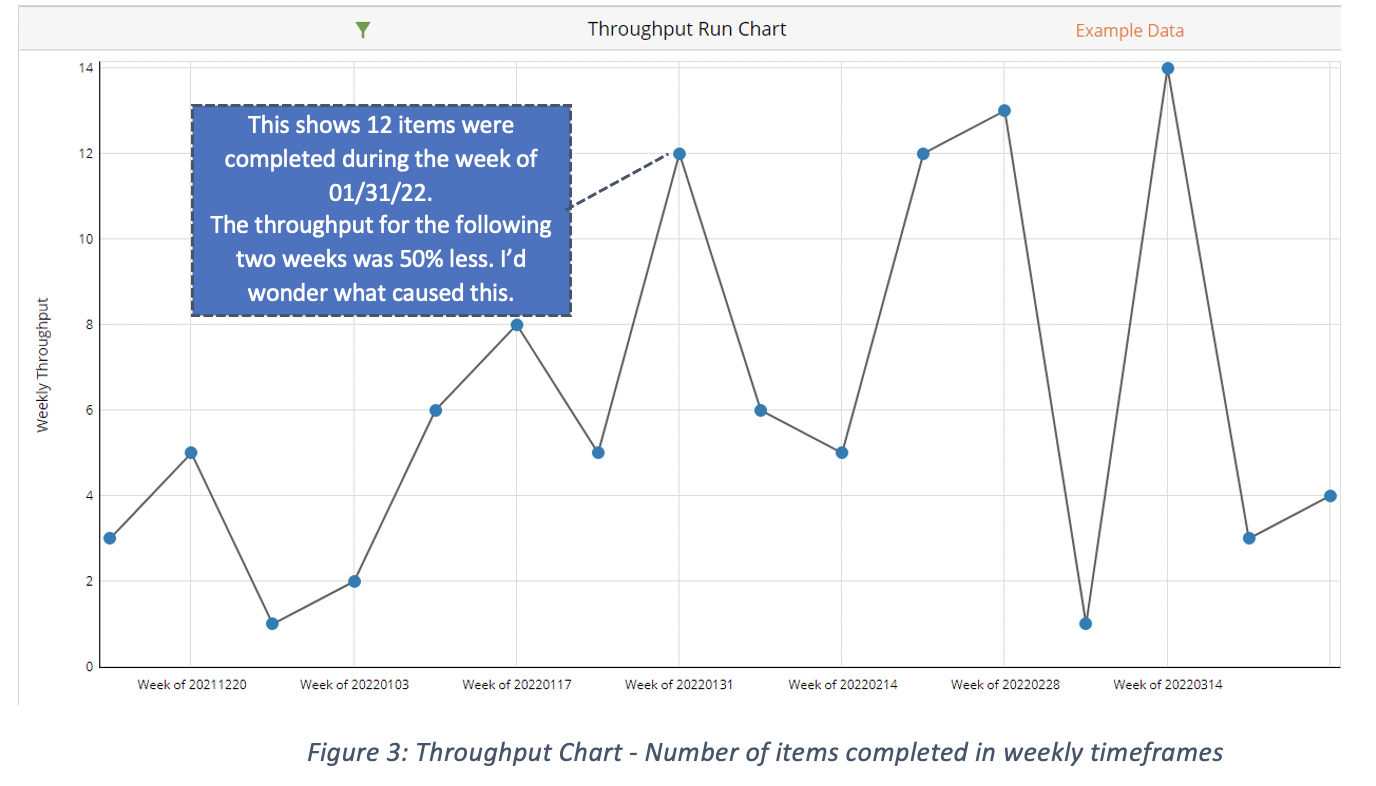
The throughput chart show the items completed across a timespan within the recent past (e.g., the previous month). This is also called a run chart or a control chart. The timespan is broken down into smaller, consistent timeframes. These timeframes can be weekly, daily, monthly, or hourly. The y-axis shows the items completed within each time frame. The x-axis shows each time frame. Use this report to see fluctuations in throughput. Some fluctuation is normal. Pay attention to trends. Is the throughput trending up, down, or is it fairly consistent throughout? This data is a good tool to assess predictability. If you detect noticeable trend changes, you have a solid foundation for an in-depth conversation with the team, so you can collaboratively evaluate and figure out the source(s) of the variances and make modifications to your system to improve.
Reading the Chart
Setting Up the Chart
- Determine what will indicate “completed work.” This data will populate the y-axis.
- Common options include:
- Number of items (this is the most common option).
- Number of tasks
- Common options include:
- Story points
- Determine the initial timespan. This will be the range depicted in the x-axis. In general, keep the timespans you assess consistent, so you compare similar data.
- Common options include:
- Weekly
- Monthly
- Quarterly
- Common options include:
- Determine the timeframes. This will be the ticks along the x-axis. In general, keep the timeframes you assess consistent, so you compare similar data.
- Common options include:
- Daily
- Weekly
- Hourly
- Common options include:
- Discuss with the team and decide what is causing the trend fluctuation and decide on a strategy to improve the system.
Conclusion
The burnup, burndown, and throughput charts are all simple from Scrum Masters to set up, maintain, and produce. They are also easy for metric-illiterate folks to understand. I highly recommend Scrum Masters master these three reports. Learn more about our Scrum Master training options to advance your skills.